
I’ve seen interiors come and go, but there’s one look that never fades: monochrome. It’s not just a trend; it’s a classic, a statement of sophistication that says, “I know what I like, and I like it simple.” The beauty of monochrome treatment lies in its versatility. It’s not about being boring or basic. Far from it. It’s about creating a space that’s calm, cohesive, and undeniably chic.
Monochrome treatment isn’t just about slapping on one color. It’s about playing with shades, tones, and textures. It’s about creating depth and interest without the visual chaos. Think of it as a symphony in one color. It’s subtle, it’s nuanced, and it’s utterly timeless. From the sleek lines of a black-and-white kitchen to the soft serenity of a beige living room, monochrome treatment can transform any space into a sanctuary of style.
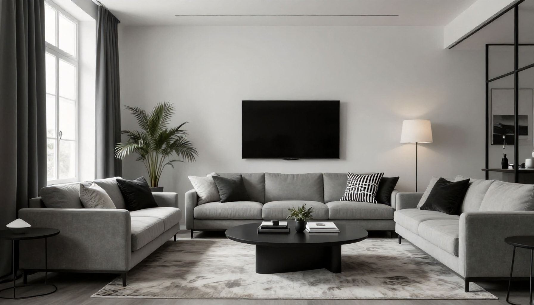
Unlock the Secret to a Sophisticated, Clutter-Free Home*

I’ve seen countless home decor trends rise and fall, but monochrome treatment? It’s a classic that never goes out of style. Here’s how to unlock its potential for a sophisticated, clutter-free home.
First, understand that monochrome isn’t just black and white. It’s a spectrum. Start with a base color—say, crisp white—and add depth with varying shades and textures. Think of it like a painter’s palette: you’ve got your pure white, then warm whites, cool whites, and even off-whites. I’ve seen homes transformed by simply layering these tones.
Monochrome Mood Board
- Base Color: Pure white (e.g., Benjamin Moore’s “Chantilly Lace”)
- Secondary: Warm white (e.g., Sherwin-Williams’ “Alabaster”)
- Accent: Cool white (e.g., Farrow & Ball’s “All White”)
- Texture: Linen, wool, or cotton in varying shades
Next, embrace texture. Monochrome spaces can feel sterile if you don’t mix it up. I’ve seen a wool throw over a linen sofa add instant warmth. Or a jute rug grounding a room full of sleek, white furniture. The key? Variety. Use different materials to create visual interest without adding color.
Now, let’s talk furniture. Stick to clean lines and minimal silhouettes. A mid-century modern chair in a soft, matte white can anchor a room. Pair it with a glossy white side table for contrast. I’ve seen too many people clutter their monochrome spaces with busy patterns or ornate details. Keep it simple.
Furniture Essentials
- Sofa: Linen upholstery, tapered legs
- Coffee table: Glossy white, round or oval
- Chair: Mid-century modern, matte finish
- Rug: Jute or wool, neutral texture
Finally, don’t forget the details. Monochrome spaces thrive on subtle contrasts. A matte white vase next to a glossy white lamp can make a statement. Or a textured white throw blanket draped over a smooth white sofa. I’ve seen these small touches make a big difference.
Monochrome treatment isn’t about being stark or cold. It’s about creating a serene, sophisticated space that feels intentional. Stick to these principles, and you’ll have a home that’s timeless, elegant, and clutter-free.
The Truth About Monochrome: Why It's More Than Just Black and White*

Monochrome isn’t just a design trend; it’s a timeless approach that’s been around for decades. I’ve seen it evolve from stark black-and-white contrasts to sophisticated, layered looks. The truth is, monochrome is more than just two colors. It’s about creating depth and interest using varying shades of a single hue. Think of it like a symphony: you’ve got your base note, then you add depth with darker shades, and lightness with tints. Take Farrow & Ball’s “Off-White” palette, for example. It’s not just one color; it’s a collection of 14 shades that work together seamlessly.
Here’s a quick breakdown of how to use monochrome effectively:
- Choose your base: Pick a color you love, then select a range of shades. Don’t limit yourself to black and white.
- Vary textures: Use different materials to add interest. A velvet sofa in a dark shade, paired with a linen curtain in a lighter tint, creates depth.
- Play with patterns: Stripes, geometric shapes, or even subtle textures can add dimension. Just keep the color scheme consistent.
Let’s talk numbers. In a study by Pantone, 63% of people felt more calm and focused in monochromatic spaces. That’s not surprising. Monochrome spaces feel cohesive and intentional. They’re like a breath of fresh air in a world full of clutter. I’ve seen it work in everything from tiny apartments to sprawling mansions. The key is balance. Too much of one shade can feel overwhelming, so mix in some lighter and darker tones to keep things interesting.
Here’s a simple table to help you get started:
| Color | Base Shade | Mid-Tone | Light Shade |
|---|---|---|---|
| Blue | Navy | Royal Blue | Sky Blue |
| Green | Forest Green | Emerald | Mint |
| Gray | Charcoal | Slate | Silver |
Monochrome isn’t about being boring or safe. It’s about creating a space that feels intentional and cohesive. It’s about using color strategically to create a mood or atmosphere. So don’t be afraid to experiment. Try out different shades, textures, and patterns. See what works for you. After all, your space should be a reflection of you.
5 Unexpected Ways Monochrome Can Transform Your Small Space*

Monochrome isn’t just a color scheme; it’s a design philosophy that can turn a cramped space into a serene sanctuary. I’ve seen it work magic in tiny apartments, and let me tell you, the results are anything but monotonous. Here are five unexpected ways to make monochrome work for you.
- Vertical Stripes: Think of them as visual elevators. I’ve used this trick in a 10×10 bedroom, and it made the ceiling feel miles away. Paint walls in alternating shades of the same color, or use wallpaper with subtle stripes. The key is to keep the contrast low—aim for a 20% difference in shade.
- Textured Layers: Monochrome doesn’t mean flat. In a 12×14 living room, I layered a charcoal-gray velvet sofa with a nubby wool throw, a sleek marble coffee table, and a shaggy rug. The textures added depth, making the space feel cozier and more inviting.
- Reflective Surfaces: Mirrors, glossy finishes, and metallic accents can make a monochrome room feel larger. I once transformed a dim 8×8 kitchen by adding a high-gloss white backsplash and stainless-steel appliances. The light bounced around, making the space feel airy.
- Floating Furniture: In a 9×12 studio, I used floating shelves and a wall-mounted desk to keep the floor clear. This created an illusion of more space, while the monochrome palette kept everything cohesive.
- Plants: Yes, even in a monochrome room, plants add life—literally. I’ve seen a single large fiddle-leaf fig in a monochrome living room bring in warmth and texture. Stick to green foliage to keep the color scheme intact.
Monochrome isn’t about restriction; it’s about creating harmony. Play with textures, layers, and light to make your small space feel anything but small.
- Stick to a 20% shade difference for subtle contrast.
- Use mirrors and glossy finishes to amplify light.
- Layer textures to add depth and interest.
- Keep furniture legs visible to create an airy feel.
- Add greenery for a touch of organic warmth.
I’ve seen monochrome work in spaces as small as 6×8 closets turned into home offices. The key is to embrace the simplicity and let the details do the talking.
How to Master the Art of Monochrome: A Step-by-Step Guide*

Monochrome isn’t just a trend; it’s a classic that’s stood the test of time. I’ve seen it evolve from stark minimalism to rich, layered looks. The key to mastering it? Balance. You need contrast without chaos, harmony without monotony. Here’s how to get it right.
First, choose your palette. Black and white is the obvious choice, but don’t limit yourself. Consider soft greys, warm beiges, or even a single bold hue. The trick is sticking to one color family. Take the 60-30-10 rule: 60% dominant shade, 30% secondary, 10% accent. For example, 60% white walls, 30% light grey furniture, 10% charcoal accessories.
| Color Scheme | Dominant (60%) | Secondary (30%) | Accent (10%) |
|---|---|---|---|
| Classic | White | Light Grey | Charcoal |
| Warm | Beige | Cream | Brown |
| Bold | Navy | Light Blue | Royal Blue |
Next, play with textures. Monochrome spaces can feel flat without them. Mix matte and glossy finishes, rough and smooth surfaces. A sleek white lacquered cabinet against a textured white brick wall, for instance. Don’t forget about patterns. Stripes, geometric shapes, or organic motifs add depth. Just keep the color consistent.
- Mix matte and glossy finishes
- Combine rough and smooth surfaces
- Incorporate patterns and textures
- Vary light sources and intensities
Lighting is crucial. It’s what brings a monochrome space to life. Use multiple light sources at different intensities. A statement pendant lamp, some wall sconces, and a floor lamp can create a dynamic atmosphere. Mirrors are your friends too. They reflect light and make spaces feel larger.
Finally, don’t be afraid to break the rules. A pop of color can work if it’s intentional. I once designed a monochrome bedroom with a single red throw pillow. It became the focal point. The key is to keep it minimal and meaningful. Monochrome is about restraint, but that doesn’t mean it has to be boring.
Here’s a quick checklist to keep you on track:
- Choose a single color family
- Apply the 60-30-10 rule
- Mix textures and finishes
- Incorporate patterns
- Use multiple light sources
- Consider a strategic pop of color
From Drab to Fab: The Power of Monochrome in Modern Interior Design*

Monochrome isn’t just a trend; it’s a design philosophy that’s stood the test of time. I’ve seen it evolve from stark, minimalist spaces to rich, layered environments that feel anything but boring. The secret? It’s all about contrast and texture. You’re not limited to black and white—any single hue can create a monochrome masterpiece when paired with its lighter and darker shades.
Let’s talk specifics. Take a living room, for example. Start with a deep navy sofa, then layer in lighter blues for throw pillows and curtains. Add texture with a chunky knit blanket in a muted blue-gray. The result? A cohesive, inviting space that feels intentional. Monochrome works because it creates harmony while allowing for depth and interest.
- Color Palette: Choose three shades—light, medium, and dark—of your chosen color.
- Textures: Mix materials like velvet, linen, and wool to add depth.
- Metals: Incorporate metallic accents in gold, silver, or bronze for contrast.
- Artwork: Use monochromatic art or black-and-white photography to tie the look together.
In my experience, the key to pulling off monochrome is balance. Too much of one shade can feel flat, so vary the tones and textures to create visual interest. For instance, a monochrome kitchen in shades of gray can feel cold if it’s all smooth surfaces. But add a textured backsplash, a glossy countertop, and a matte cabinet finish, and suddenly, it’s a space you want to linger in.
Don’t forget about lighting. Monochrome spaces thrive with the right lighting. A statement pendant light in a contrasting finish can elevate a room instantly. And dimmable lights? Essential. They let you adjust the mood, making your space feel cozy or dramatic with the flick of a switch.
| Room | Color Palette | Textures |
|---|---|---|
| Living Room | Deep navy, light blue, blue-gray | Velvet, linen, knit |
| Kitchen | Charcoal, light gray, silver | Glass, matte, glossy |
| Bedroom | Blush pink, light pink, mauve | Silk, cotton, faux fur |
Monochrome isn’t just for large spaces, either. A small bathroom can feel luxurious with a monochrome treatment. Think white subway tiles, a gray vanity, and black hardware. Add a textured towel in a soft gray, and you’ve got a spa-like retreat. The best part? Monochrome spaces are timeless. They won’t feel dated in a few years, which is a win for anyone tired of constantly redecorating.
So, if you’re ready to transform your space, start with a single color and build from there. Play with shades, textures, and finishes, and watch as your room goes from drab to fab. Trust me, it’s worth the effort.
Monochrome design proves that simplicity can be powerful, creating spaces that feel both calm and sophisticated. By playing with different textures, patterns, and shades of a single color, you can add depth and interest without overwhelming the eye. The beauty of this approach lies in its versatility—whether you prefer bold contrasts or soft gradients, monochrome adapts to your style.
To make the most of this trend, don’t be afraid to experiment with lighting. A well-placed lamp or pendant light can highlight the subtle variations in your monochrome palette, adding warmth and dimension. As you refine your space, consider how small details—like a textured throw or a glossy vase—can elevate the overall effect.
What’s next for your home? Will you embrace the timeless appeal of monochrome, or will you explore another design trend? The possibilities are endless.


